For me, UX/UI design isn’t about pixels and layouts–it’s about connecting with users and making their lives just a little bit easier. It’s about representing their perspectives when decisions are made about products they find essential to their work or daily life. If I’ve done my job well, then I’ve made your work feel seamless, efficient, and maybe, maybe even a little bit delightful. This deep-seated belief in user-centered design is what fuels my excitement about our SCORM Cloud UI redesign–we have an amazing opportunity to take a beloved, industry-essential product and evolve it into something even better.
And for those in the eLearning world, SCORM Cloud is more than just a product; it’s the foundation. It’s been a reliable workhorse for years, helping countless organizations and training creators test, deliver, share, and track their learning content. What makes SCORM Cloud so enduring? It’s the core functionality, the robust reliability, and the deep understanding of both specific learning standards and the broader eLearning ecosystem. For many of you, it’s a familiar and dependable tool that gets the job done, plain and simple. We understand and respect that.
We also realize that there’s room for improvement. Over the past few years, it became clear that Cloud’s out-of-date frontend technology was holding us back from offering the experience we wanted. It’s probably also not a secret that design hasn’t kept up over the years as the development team focused on functionality and reliability. That’s led to some inconsistencies in the user interface, some less than ideal workflows, and a somewhat eclectic visual design.
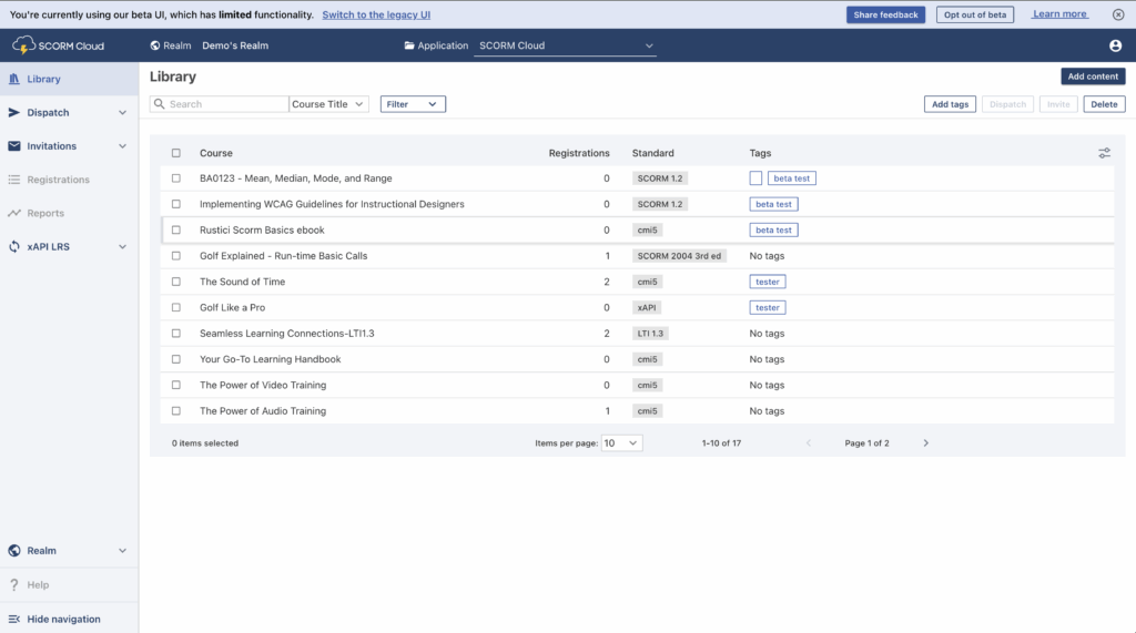
SCORM Cloud’s new look
So we’ve decided it’s time for an upgrade. We’ll soon start rolling out updates to SCORM Cloud’s user interface. Our goal with this redesign is to build upon Cloud’s strong foundation but also to provide a better user experience, streamlined workflows and enhanced functionality.
Our approach is two-pronged. We’re rebuilding our frontend code, allowing us to build a modern interface that is both flexible and scalable for the future. At the same time, we’re redesigning the user interface to improve usability and information architecture, enhance accessibility, and create a more modern and visually engaging experience.
Introducing … Me!
The design part is where I come in. As part of our commitment to improving the experience of SCORM Cloud users, Rustici Software hired me as our first UI/UX designer. It’s my job to identify problems with Cloud’s user experience and design solutions that make the product better while maintaining the SCORM Cloud experience you trust.
From my first glance at SCORM Cloud, I saw the need for purposeful visual design, so we can offer the best experience for users. Something I quickly noticed is that seemingly similar pages have inconsistent layouts, use of colors, and button design. One example is the action buttons on the Course Library and Dispatches pages–they’re in totally different locations, creating a jarring experience.

These issues might seem superficial, but they increase a user’s mental load–the amount of brain processing power needed to understand and use a product. Consistency in design and purposeful use of color are key to helping users complete their tasks efficiently.
Improving user experience
But my role isn’t just about what SCORM Cloud looks like–it’s about the entire experience of using it. There are a lot of tasks, such as uploading multiple courses or creating a dispatch with a registration cap and expiration date, that just take more steps than they should. There’s also a clear need for more robust tools, such as filters and bulk actions, to help users manage larger collections of courses, dispatches, and invitations. A core part of my job is to identify these pain points and design effective solutions that make using SCORM Cloud better and easier so you can get your work done with less time and effort.

What’s next?
Redesigning and rebuilding a user interface is a big project, so you’ll see it unfold gradually. Throughout, I’ll be working with our developers and product team to ensure that your needs are taken into account in every step of the process. We’ll be soliciting your feedback beginning with the first stage of the rollout and working together to create an updated interface that feels both fresh and familiar, streamlining workflows and making key features more intuitive.
We believe that this approach–building on the proven core of SCORM Cloud while embracing modern technologies and design practices–will lead to an even stronger and more valuable SCORM Cloud for everyone. We’re excited for what’s next and focused on continuing to serve the eLearning community with a powerful, easy-to-use platform.
If you want to learn more, you can check out the article that goes over accessing and using the Beta UI. You can also stay up to date on the Beta as we continue to make improvements by subscribing to SCORM Cloud release notes or reaching out to our team with interest.


