We’ve gotten a lot of feedback about Content Controller since we started working on it back in 2015: feature requests, bug reports, criticisms and praise. We also have conversations with customers and potential customers about what problems Content Controller solves for them and where it falls short. This feedback is valuable because it tells us where we should focus our efforts to improve our software. There is one criticism that we’ve heard very frequently: performing routine tasks in the UI requires too much clicking. So with Content Controller v2.0, we’ve tried to do something about it.
Consider a common scenario: You’ve just signed on a new client who needs access to your entire course library under your popular “10,000 learners per course, per year” plan, and now you need to add all of those courses to the new client’s Content Controller account. This is a daunting endeavor with Content Controller v1.2, because you’d need to add each course individually, clicking through the same dialog and selecting the same options for each. With two license limits (a learner limit of 10,000 and an expiration date one year in the future), that works out to about 13 clicks per course. With library of hundreds of courses, you’d be in for a long, boring day of clicking. Content Controller has long had an API that can be used to automate this sort of task, but clearly some improvements were needed for our UI users.
So what’s changed in Content Controller v2.0? For one, we’ve added license templates so you can define a set of limits with a descriptive name, and then quickly apply the template when adding courses to an account. We’ve also added autocompletions and tag support to Content Controller’s search bars, so you can more easily find the courses you’re looking for.
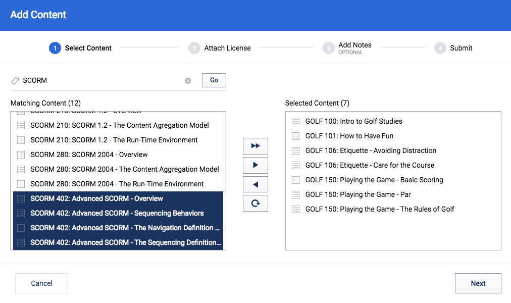
But most importantly, we’ve replaced the UI for adding courses to an account with an entirely new UI that allows you select your entire course library, or just a subset, and add all of the selected courses at once while applying the same license limits to each. Populating an account with your entire course library, no matter how large, takes as few as nine clicks with the new UI in Content Controller v2.0. If you have 100 courses in your library, that’s a 99% reduction compared to Content Controller v1.2.
This isn’t the only improvement we’ve made in Content Controller v2.0 (see the release notes for a full list), but if I had to guess, I’d say it’s the one that will have the biggest impact for day-to-day use. But we can’t know that for sure until we start getting feedback from users. If you’ve tried out Content Controller v2.0, and think of ways we could make it better, let us know! We want to hear from you.


